We Are

Kajoo Creative Studio – a fun & young(ish) collective of freelancers working together to bring you and your awesome ideas to life, make lifelong connections and build a bunch of beautiful and fun things!

View Projects
kajoo studio workplace

We Create

Beautiful and tailor made projects. Working together we're awesome! From small graphic projects to entire web applications we've got you covered. We take pride in delivering quality-driven products while making sure that details are not forgotten along the way. Here's a sample of some of our favourites:
verifyr
  • Brand Design
  • Development
  • Illustration
  • UX Design
  • Webdesign

verifyr

Date: October 2021
Client: verifyr
Roles: Brand Design, Development, Illustration, UX Design, Webdesign,

2FA for your team

A place to manage 2FA for members of your team. Add members, services and create automated actions so every member of your team can have access to 2FA enabled apps without any verification hassle. We were responsible for the UI and UX design as well as the front end implementation of the project.
DoceAtelier project thumbnail
Doce Atelier
  • Brand Design
  • Design

Doce Atelier

Date: January 2021
Client: Doce Atelier | Portugal
Roles: Brand Design, Design,

As sweet as a cake!

Bibiana reach out to us to rebrand her business logo. Our briefing: it cannot be a cake and must be delicate to include our new party decorations services. So we inspire ourselves on the beautiful decorations and cakes from Doce Atelier. The result is as sweet and graceful as our client business.
Soyup project thumbnail
SoyUp
  • Brand Design
  • Development
  • Packaging
  • Webdesign

SoyUp

Date: April 2021
Client: Nugenis | Austria
Roles: Brand Design, Development, Packaging, Webdesign,

Naturally Austrian

We were once again trusted by Nugenis GmbH to design their newest product. The briefing was simple: be bold! And so we did, from the brand identity to the product package we created some vibrant and compelling visuals that we then used to create a modern and interactive website that showcases their product.
Xpand pro logo project cover
Xpand Pro
  • Design
  • Development
  • Webdesign

Xpand Pro

Date: February 2021
Client: Xpand Pro | Portugal
Roles: Design, Development, Webdesign,

Dared to change! xPAND

We were trusted by Xpand Pro to redesign their old website from scratch. Since we do know the brand very well (Paula is our client for 2 years and counting) we knew exactly what and how to do it. The design is fresh, modern and very intuitive just as Xpand.
Touche de beauté project thumbnail
Touche de Beauté
  • Brand Design
  • Design

Touche de Beauté

Date: June 2020
Client: Touche de Beauté | Switzerland
Roles: Brand Design, Design,

Elegance & charisma

We were contacted by Filipa to create an elegant, clean, and feminine logo for her new office. Our idea was to have a smooth brush behind the lettering to make the link with the "touch" but not to drawn much attention to it since the word Beauté (Beauty) is the main focus of the logo. The result is a very elegant branding, full of charisma and simplicity, just like our client.
myclassictrip webdesign project thumbnail
My Classic Trip
  • Brand Design
  • Development
  • Webdesign

My Classic Trip

Date: April 2020
Client: myclassictrip.com | Germany
Roles: Brand Design, Development, Webdesign,

Show off your classic!

What happens when you get together some gearheads with a love of technology? A web portal that enables you to advertise your events or find events that you'd like to go is born! We were trusted to create the branding and the website design and frontend and being gearheads ourselves we couldn't have had more fun doing it!
EatPlants project thumb
Eat Plants
  • Brand Design

Eat Plants

Date: September 2020
Client: EatPlants | Switzerland
Roles: Brand Design,

Vegan Food Online

Our briefing for this project was very clear. It had to be green, plant based and full of symbology! Easy right? Not quite but we nailed it! We merged the leaf (Vegan food) and the map pin (delivery part) inside an yin yang (health) symbol and ended up with an amazing logo for an amazing vegan food delivery portal.
hugo
  • Brand Design
  • Design

hugo

Date: January 2020
Client: hugo - Contabilidade e Seguros | Portugal
Roles: Brand Design, Design,

Modern accountant

Hugo reached out to us with the need to rebrand his new office. He has 20+ years of experience in the account & insurance business and he wanted a logo that was both classy and modern. Of course we delivered! Along with the rebranding there was a need to design all the stationery, the office windows displays and social media communication.
Marivest project thumbnail
Marivest SA
  • Brand Design
  • Webdesign

Marivest SA

Date: September 2020
Client: Marivest SA | Switzerland
Roles: Brand Design, Webdesign,

Investing for a better future

Marivest SA is a Swiss holding company investing in startups and companies with growth potential and they reach out to us to design their new logo and website. With 15 years of experience they needed a branding that reflects their goals and company vision. We combined the "M" from their name with a growing graphic and voilá - the perfect logo! The website design was a simple and effective single page presenting the company.
Kiru
  • Brand Design

Kiru

Date: September 2019
Client: Kiru | Portugal
Roles: Brand Design,

From pixel perfect to laser cutting

Our briefing for this branding was: You know what, I trust you :) We wanted the logo to be simple but have real connection to the business of this company. So bullseye... literally! We used the "I" in the logo to create the target in the laser machine! The result is so effective and yet so discreet. We also created a simple symbol with only the "K" and the target for watermarks and profile pic on social media.
Vegaras
  • Brand Design
  • Design

Vegaras

Date: September 2020
Client: Vegaras | Switzerland
Roles: Brand Design, Design,

Vegan Market on your couch

Our client reach out to us for the design of the new logo, as well as the promotional material to lunch the web marketplace. Our idea was to make the logo handwritten so it would have a more natural/human look and add the leaf so it goes straight to the point of the company. The result is a very clean logo and a really clear message.
Blackserver
  • Brand Design
  • Development
  • UX Design

Blackserver

Date: March 2019
Client: Blackserver | Germany
Roles: Brand Design, Development, UX Design,

Purchase servers with cryptocurrency

Blackserver is an online service that allows you to rent servers and purchase domains from your favourite hosts with cryptocurrencies. We were commissioned to create the entire visual and app identity as well as leading the front-end development process.
In a Language
  • Brand Design
  • Development
  • Motion Design
  • UX Design

In a Language

Date: October 2018
Client: In a Language | Germany
Roles: Brand Design, Development, Motion Design, UX Design,

Online translations done right

Ina reached out to us with the need to create a web app for an online translation service. The service included a back-office where clients could upload and manage their translation projects and get support from the translation team. We were also lucky enough to be able to developed the entire brand imagery.
Nanô
  • Brand Design
  • Development
  • Webdesign

Nanô

Date: April 2019
Client: Nanô | Portugal
Roles: Brand Design, Development, Webdesign,

Cutest online store for babies

Nanô is a new online boutique with cute clothes for babies, kids & future mums, all made in Portugal. We created a logo that could embrace both public, the mums buying for their kids and the mums buying for themselves. The result is a clean and flowing logo similar to a signature, cute but strong and capable of working in all the different products of the store and across all communication. Apart from that we developed the cutest and intuitive online store.
GrindaBuck
  • Development
  • Illustration
  • UX Design

GrindaBuck

Date: June 2019
Client: EKardinal | Portugal
Roles: Development, Illustration, UX Design,

From a clean UX to a fun UI

We were asked to rethink the UX and come up with a modern and intuitive UI with total creative freedom. And did we have fun doing it! From the UI to the illustrations to the ADS banners, every piece of it was a ball in the park. We loved working in this project and it kinda of shows :)
Masterschool
  • Brand Design
  • Design
  • Webdesign

Masterschool

Date: September 2019
Client: Masterschool | Portugal
Roles: Brand Design, Design, Webdesign,

Modern language school

This was not about creating a new logo, this was about developing a new identity for this languages school in Oporto. We developed the new brand, that leaded to the new decor and feeling of the school building, we designed the show window, the posters for the school and, of course, the website.
Nugenis
  • Brand Design
  • Illustration
  • Packaging

Nugenis

Date: July 2016
Client: Nugenis | Austria
Roles: Brand Design, Illustration, Packaging,

Rebranding an award winner company

Nugenis reached out to us from Vienna with a need for a total rebrand of their logo and a new mascot to go along with the new vision for the company. We were also commissioned to design their promotional material for fairs and trade markets as well as the new packaging for their award winning products.
Blacktel.io
  • Brand Design
  • Development
  • Motion Design
  • UX Design

Blacktel.io

Date: August 2018
Client: Blacktel | Germany
Roles: Brand Design, Development, Motion Design, UX Design,

Create your personal virtual phone

Blacktel.io reached us with the idea to create a platform for purchasing virtual numbers all around the world. The premise was simple: you should be able to create your personal virtual phone in order to make and receive calls, SMS and even fax – all online, in your browser or phone. The interface should be streamlined and easy to understand since it had so many modules and features. Using a clean design and with the help of custom icons and illustrations the result is an easy to use application that doesn’t confuse the end user.
COACHit
  • Brand Design
  • Development
  • Webdesign

COACHit

Date: February 2019
Client: COACHit | Portugal
Roles: Brand Design, Development, Webdesign,

COACHit, a rebrand & webdesign story

Rebranding the COACHit logo was a nice challenge. The client gave us total design freedom. How lucky were we!? We based our creation on the sacred geometry and designed a beautiful, clean and meaningful logo with strong imagery and colours. For the website we kept the structure very clean with simple animations for an intuitive user experience as well as pleasurable navigation.
Spoofbox
  • Brand Design
  • Development
  • UX Design

Spoofbox

Date: October 2016
Client: RTS Media | Germany
Roles: Brand Design, Development, UX Design,

A central hub for spoof apps

We were commissioned to design a central hub for all the spoof apps made available by RTS Media. Since there was the need to add more apps at any time a full framework was developed allowing new apps to be integrated into the system with ease. Along with the website identity we also developed a mascot that’s used in a variety of scenarios within the apps.
Razawane
  • Brand Design

Razawane

Date: March 2019
Client: Razawane | Mozambique
Roles: Brand Design,

Luxury brands marketing consultor

Razawane, a luxury brands consulting agency, needed a new brand to reflect the market they represent. Of course they reach out to us. And of course we delivered! The result? A clean, meaningful new logo with beautiful colours and shapes. The clean geometric lines took the logo to a new level of classy. Not bragging, but it really works.
Spoof My Phone
  • Brand Design
  • Development
  • Motion Design
  • UX Design

Spoof My Phone

Date: November 2014
Client: RTS Media | Germany
Roles: Brand Design, Development, Motion Design, UX Design,

Spoofing calls, the funny way

We were commissioned by RTS Media to design and develop a new app that allows you to create spoofed phone calls. The project included the brand design as well as the creation of the web app and a series of introductory video tutorials for the Spoof My Phone App. With full creative freedom we really enjoyed how they turned out. These were also translated to a number of languages – check out their website for more info.
Piki
  • Brand Design

Piki

Date: March 2018
Client: Piki | Portugal
Roles: Brand Design,

A fun & classy brand of bracelets

The client reached out to us in order to rebrand Piki – a young, high end jeweller for classy and modern woman. The briefing was pretty straight forward: young, clean, classy and modern. We added the dots to the P & K to represent the charms in each bracelet designed by Piki. This also allowed the brand to change it’s dot’s colours to match the bracelet in their product page. Small details do make a big difference.
Tiketa
  • Brand Design
  • Illustration

Tiketa

Date: January 2018
Client: Tiketa | Portugal
Roles: Brand Design, Illustration,

A fun and eye cachty rebrand

Tiketa called us in order to rebrand their image. We envisioned a fun and playful sun (a required element by the client) with cotton candy colors to represent all the fun products of the brand. Since their products are for children we created a cute mascot to go along the fun lettering and tadahhhh, cuteness overload.
ArtSalat
  • Brand Design
  • Design

ArtSalat

Date: October 2019
Client: ArtSalat
Roles: Brand Design, Design,

YouTube channel identity

ArtSalat is a brand new You Tube art channel dedicated to video/audio. So for the visual identity we added a “Play” element in between the name to represent the video (image, movies, etc) and the dots represent music notes (audio). The logo is really clean and modern so it can endure in time, it as a Mondrian vibe to it. It has an abstract visual so it can embrace all the different arts without being too obvious. This way it will have more room to expand and include different topics in the channel. We also created a symbol with the “A” for the profile image, more readable, with more impact and, of course, in line with the visual identity of the channel.
carleon logo design
Carleon
  • Brand Design

Carleon

Date: January 2019
Client: Carleon
Roles: Brand Design,

A rebranded bouquet of class & originality

The client reached us to bring together two names, merge them into one and bring a touch of class and romanticism to the new logo. Carleon works with event decoration and planning, targeted at a young female audience. Their style is very girly, with a bunch of pink and flowers much like their new logo. We wanted their audience to recognize their style in the new brand as much as their work.
 We crafted a brand that can be in their decorations as a part of it.. yep! It’s that well done.

Are you ready?

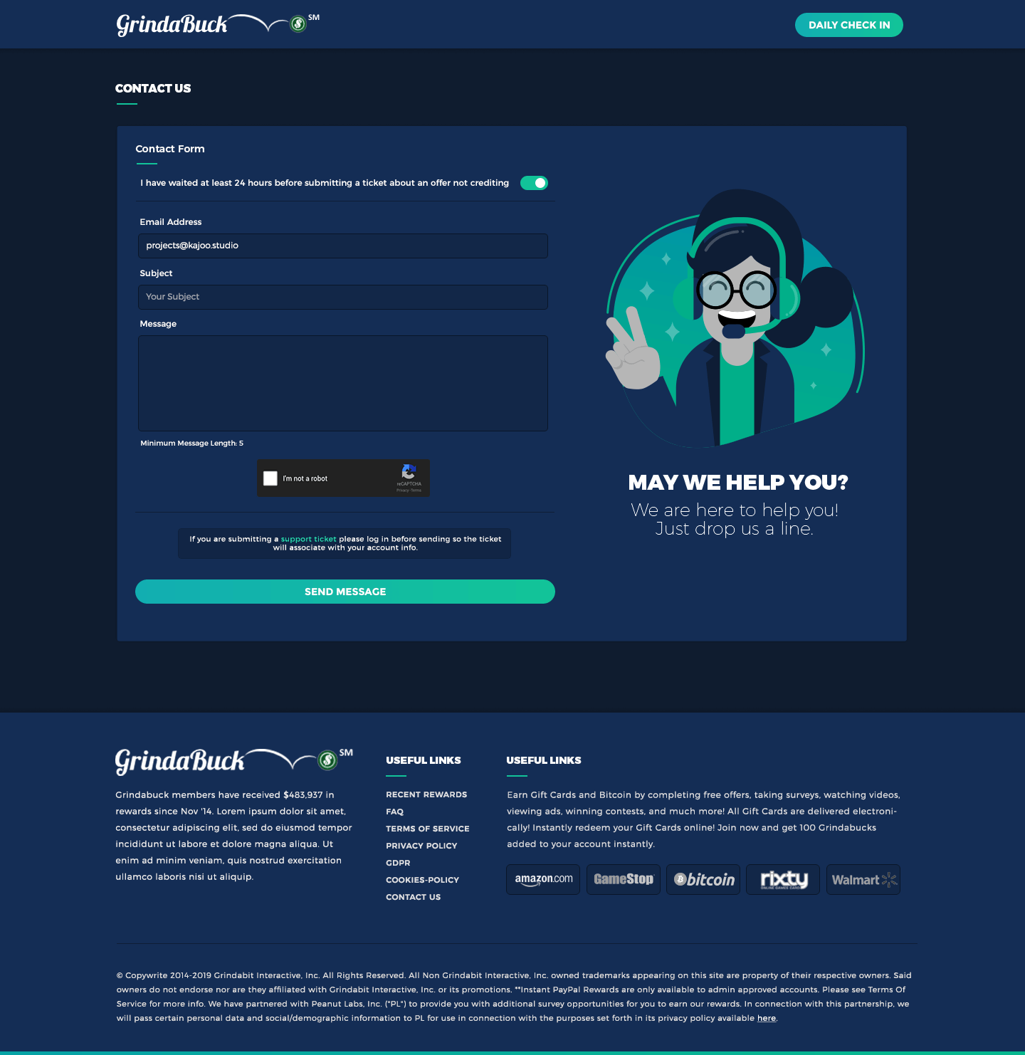
Let’s talk about your project. We’ll be as passionate as you are about it.

Get in Touch